Creating an E-mail via a Template
A template is a pre-formatted canvas which specifies the layout of a message and which you can easily adapt to suit your own needs.
Using a template to create your e-mail is the simplest option. It allows you to have a basis for the creation of your message, all while giving you a lot of flexibility.
Most templates are available at the third step of the creation of your e-mail, namely the definition of the message. To access them, select 'Create From Template'.
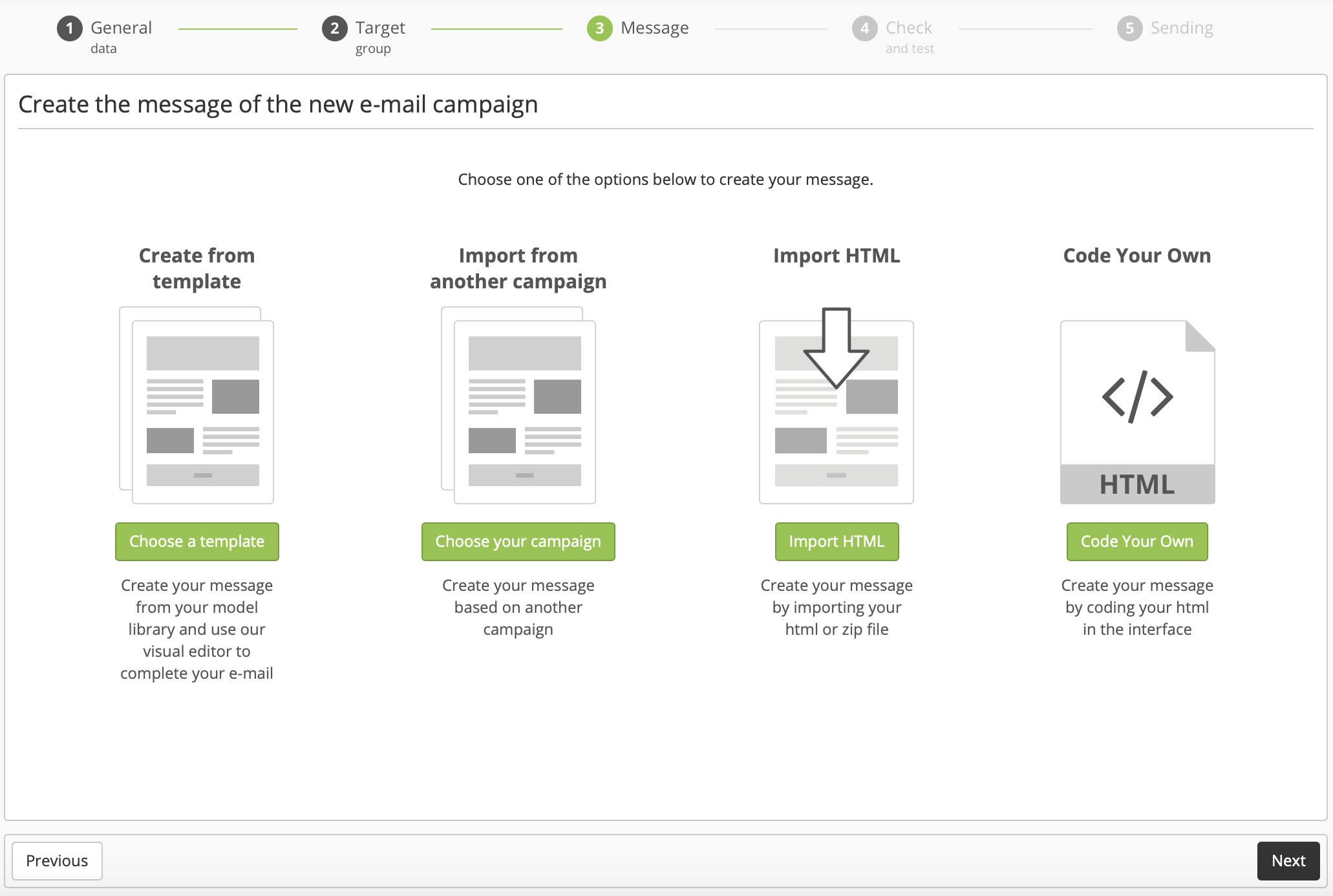
Various categories of templates stand at your disposal.
Design templates
Templates libraries
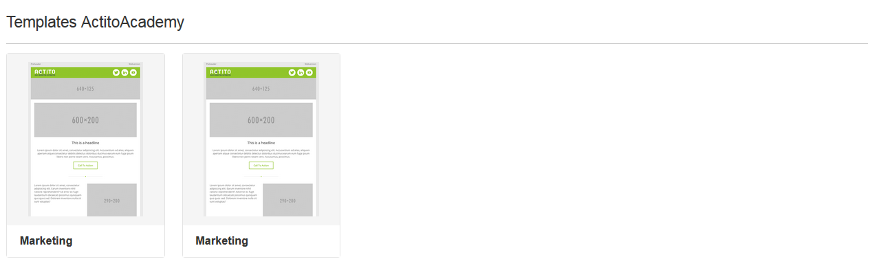
Custom templates library
These are the templates belonging to your licence. They are available in the upper section of the template selection page.
Indeed, Actito gives you the opportunity to order templates matching your specific requirements. They might:
Follow your graphical charter
Display default images and logos
Add specific blocks matching your needs
To request the creation of a custom template or to obtain additional information related to them, we invite you to contact your account manager.
Tip
This zone will only be displayed if there are existing custom templates in your licence.
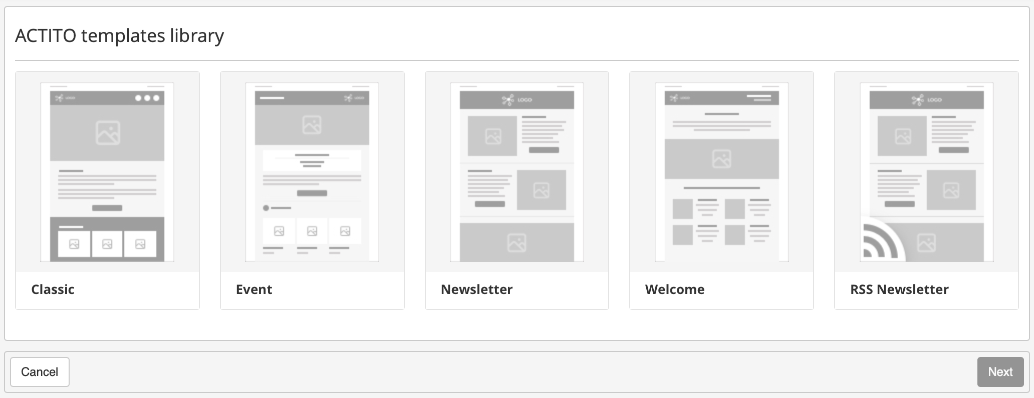
Actito templates library
Actito offers a library of templates containing layouts suited to most frequent situations, such as newsletters, event invitation or welcome e-mails. They are available in the bottom section of the selection page.
These templates only set the layout of blocks and images, while letting you freely define their content. You also retain the possibility to modify them according to your requirements.
Editing a template
After selecting your template, you will reach 'Editor mode', where you will be able to adapt the template to your needs and to fill the fields of content.
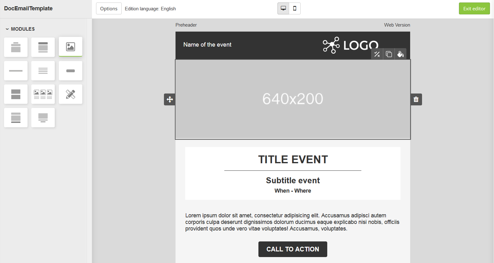
Module library
To the left of your screen, the module library gives you an overview of each block that can be added to your e-mail. To insert a module, all you need to do is to select it, then to drag and drop it where you want to insert it in your e-mail.
There are various kinds of blocks:
Headers: the 'pre-header' block, which can contain the pre-header as well as the web version link, and the 'header' block, where you can insert a logo and repeat the subject of your e-mail.
Images: it can be large banners filling all the width of the e-mail, as well as small images below of next to test zones.
Titles: with or without subtitles.
Text zones: with or without titles, with or without images.
Separators
'Call to action' buttons: theses buttons can be used to insert web pages links.
Footer: it may contain the 'unsubscribe' link, a link towards legal information,...
Some modules only appear in specific templates, such as event program blocks, address blocks and sharing on social network blocks,...
To order custom blocks or for additional information related to their practical application, we invite you to contact your account manager.
Editing modules
Next, you have the possibility to modify the structure of the modules which make up the template, as well as fillings their content.
You can:
-
Add logos and images
Whenever the small 'Choose your image' icon appears, it is possible to customize your message with an image of your choice.
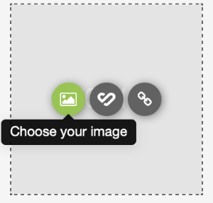
This includes large banners, side images, logos but also icons specific to some blocks, such as icons specific to some blocks, such as the 'speakers' icon for an event, or the social networks icons. If you do not modify these icons, they will be displayed with their default appearance, but you might want, for instance, to replace the black default facebook button by a facebook button with the color of your company.
The expected size of banners and side images is displayed on their grey background. If you add an image that does not match the expected size, it will be automatically resized to the proper width, all while keeping proportions when it comes to height. Consequently, distortions will be avoided but the layout of your e-mail might be affected.
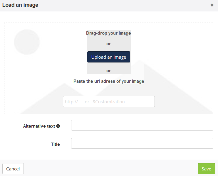
You can select images directly from your files, either by clicking the 'Upload an image' button, or with a 'drag and drop'. You can also paste the URL address of an online image.
This screen also allows you to define the image title and an alternative text. This alternative text will be displayed instead of the image should it be blocked or not downloaded, so it is good practice not to overlook it.
Tip
An image cannot exceed 1,5 MB.
-
Add links
Whenever the small 'Add a new link' icon appears, it is possible to add a link to your e-mail.
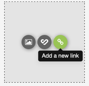
This includes:
Images
Small icons
'Call to action' buttons
Directly in the text

The link update window will let you enter towards which URL address the link must direct. You can also add a customization ($ followed by the customization name between curly brackets), for example if the link directs towards an Actito form or an 'unsubscribe' page.
The 'Encode URL' checkbox will convert your URL in percent encoding if it includes special characters. It should be unticked if your link is not standard:
if your use the 'tel:' tag, which enables you to refer to a phone number
if the URL contains geographic coordinates, such as a Google Maps URL.
You also have the possibility to give a title to the link. This is especially useful for analyzing the clicks report in your e-mails.
-
Modify colors and borders
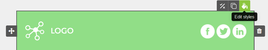
It is also possible to modify some colors, such as the background color of each module or the button color. To do so, click on 'Edit styles' at the upper right corner.
This button will open the style editor on the left of the screen.

You can edit:
The row color: this is the color of the e-mail background, which appears to each side of the e-mail body. This button only allows to modify the background section directly next to the edited module. To change the color of the whole background all at once, you have to go in the options.
The content color: allows you to change the filling color of the block itself.
The template original color will be used by default.
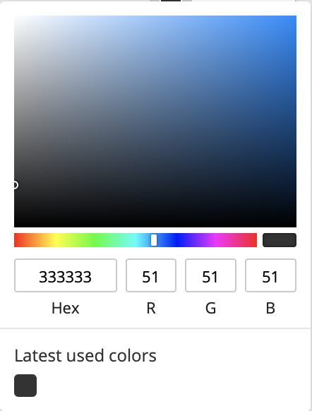
In the color picker, you can choose a color from the palette or by entering a hexadecimal or RGB code. The latest colors used and the template colors (for custom templates) will be kept in the memory.
From the style editor of a module, you can also define a border around the block to frame an image or a text.
This is what you can modify:
the border color
the weight (in pixels)
the style (simple, dotted, dashes...)
If you would like to further modify a block, you can switch on the "More options" button. You will then be able to define a border style for every single side of the block.

Do not forget to save your changes with the button in the lower part of the editor.
Tip
In the case of call-to-action buttons, you can modify the background color directly on the template.

-
Write your text
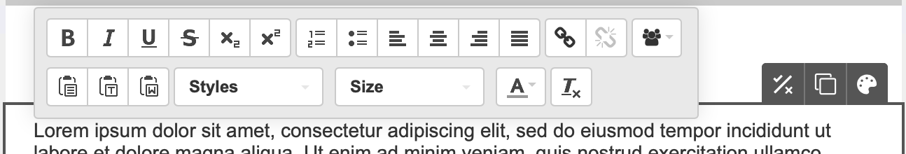
While writing your text, you will be using a rich text editor, where you will be able to apply the conventional formatting, such as modifying styles, alignment, the color and the size of your text, inserting lists or adding links (as explained above).
This is a WYSIWYG editor, which means that you will directly see any modification in your text without the display of formatting tags.
While you e-mail, you also have the opportunity to add customizations, which means using data from your profile table, or related data, in order to adapt the content to your contact. This can range from simply addressing them with their first name to advanced customizations.
For further information on this subject, we invite you to read the 'Customizing or Conditioning an E-mail' chapter.
Editing styles
Select "Global Styles", next to the module library, to define style settings for the whole E-mail.
You will then be able to edit the E-mail global styles, that is to say, the background.

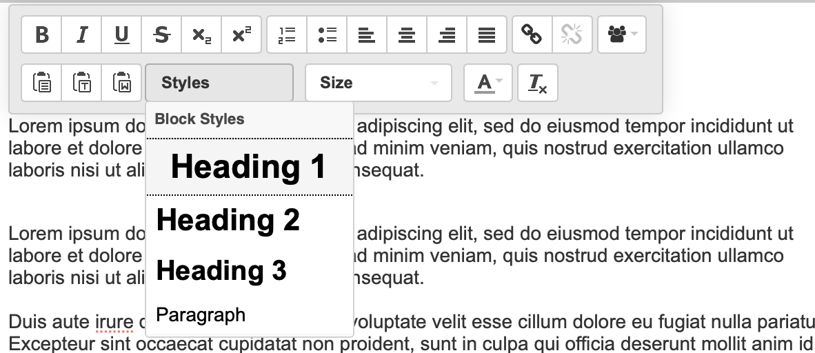
You can also define the text styles that will be used for the whole template. By default, there are three heading styles, one paragraph style, and one link style. If you are using a custom design template, there might be other styles available.
This is what you can modify for every style:
the color text
the size in pixels
the text font, from a list of preselected fonts compatible with the different E-mail servers. Again, if you are using a design template, there might be other fonts available.

The names of the different styles are just a suggestion about how to use them. If, for example, you need to use two different fonts for your paragraph text, you are free to use the Heading 3 style in the body of a message.
You can actually modify the style of a text fragment directly in the template, or you can also select a different style.
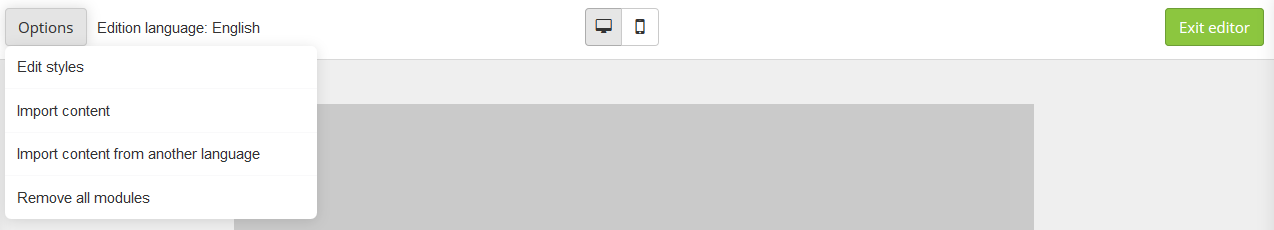
Options
At the top of the page, the task-bar lets you reach various additional options.
Previewing the rendition on smartphone
It is possible at any time to display a preview of how your message will appear on a smartphone, by clicking on the 'smartphone' icon at the top of the page, in the middle.
After that, you can go back to the computer preview by clicking on the 'computer screen' icon.
Import content
This button allows you to import HTML content. The files must be zipped beforehand.
You can choose to import styles or not.
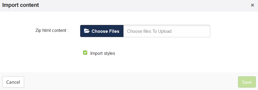
Tip
For a multilingual e-mail, the zip must contain one HTML file per language. The name of this file must end with an underscore followed by the two letters code of the language.
For example: DocTemplate_EN.html
Import content from another language
If your campaign is multilingual, you have the possibility of importing the content from another language of the campaign.
In this way, you will not have to upload each image twice if, for instance, they stay the same, or to edit styles again. You will be able to focus on translating your text and defining potential links.
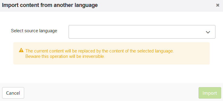
This action will replace the current content by the content from the selected language version, without any possibility to undo it.
Remove all modules
This button allows you to delete everything and start over with an empty page.
This action cannot be undone.
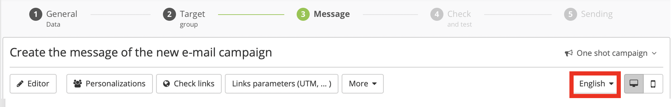
Modify edition language
If your campaign is multilingual, the current edition language is displayed next to the "Options" and "Personalizations" buttons.
You can change the language in the drop-down menu. Changing the language is only possible when the e-mail has been saved, and not when the e-mail is in the process of being saved after a change.

When outside the editor, you can still change the language on the right of the screen. You can also go back to the edit mode any time by clicking on the "Editor" button on the left of the screen.
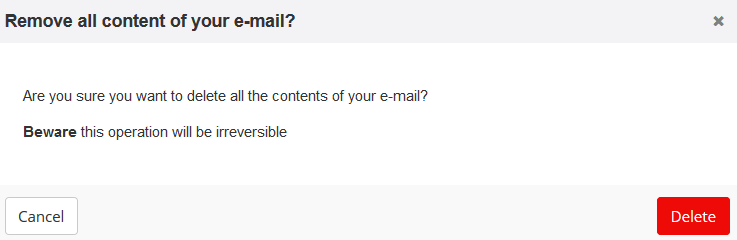
Create a new message
From the definition screen, it is also possible to delete all the content of your e-mail in order to create a new one from scratch.
For that, click on "More" and "Delete existing message".
You will then go back to the template selection page so that you can choose a different template.
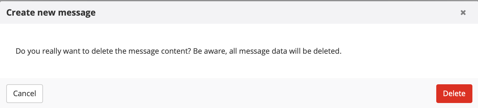
This action will delete all your progress related to the content of your e-mail. It cannot be undone.
Campaign templates
Campaign templates provide you with a sending configuration model. In contrary to the 2 other types of templates, they are not selected during the third step of the creation of your e-mail, but at the very beginning, right after clicking on 'Create campaign'. This is the screen where you are invited to select the type of e-mail you want to send.
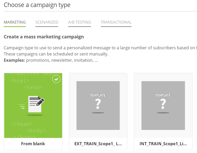
As a matter of fact, this kind of template does not only relate to the e-mail content in itself, but it also gives the opportunity to save the general data, the targeting and all other parameters.
It allows you to save the definition of a campaign and to reuse it every time you need to send a similar campaign.
To learn how to save this kind of configuration, we invite you to read the 'Saving a Campaign Template' page.